Using R studios to create visuals, predictive models and ROC curves visuals to analyze ER Overcrowding data.
Exploratory data analysis, predictive models and visualizations in Jupyter notebook with Python Code. Here you will find the data set and the code and output.
Histograms/Bar charts
Value_Distro <- ggplot(data=dfilter2, aes(x=Hour, y=NAVG))+
  geom_bar(stat="identity")
print(Value_Distro + theme(plot.title=element_text(face="bold")) + ggtitle('Distribution of NEDOC'))

Value_Distro <- ggplot(data=OVERA, aes(x=Hour, y=OVER.UP))+
  geom_bar(stat="identity")
print(Value_Distro)

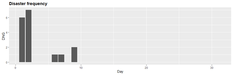
Value_Distro2 <- ggplot(data=dfilter2, aes(x=Day, y=DNG))+
  geom_bar(stat="identity")
print(Value_Distro2  + theme(plot.title=element_text(face="bold")) + ggtitle('Disaster frequency'))
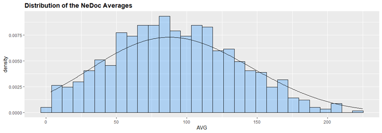
#Distribution of NeDoc Scores
DViz <- ggplot(data=dfilter1, aes(x=AVG)) +
  geom_histogram(aes(y=..density..),
                 col='black',
                 fill='dodgerblue1',
                 alpha=0.3) +
  geom_density(adjust=3)
print(DViz + theme(plot.title=element_text(face="bold")) + ggtitle('Distribution of the NeDoc Averages'))
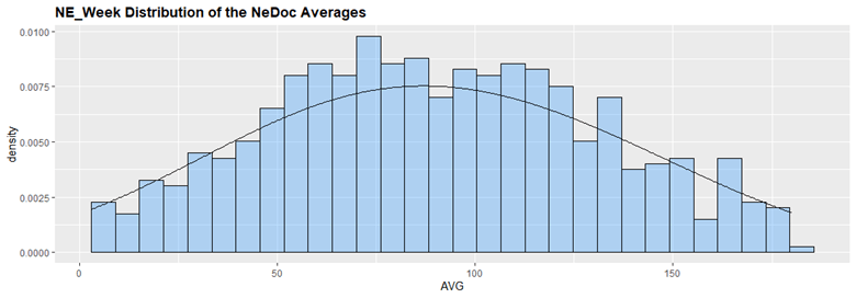
#NE_Week2 Data viz of distribution Shows more balanced avg without week 5 or Danger (only in week 1)
DVizNE <- ggplot(data=NE_Week2, aes(x=AVG)) +
  geom_histogram(aes(y=..density..),
                 col='black',
                 fill='dodgerblue1',
                 alpha=0.3) +
  geom_density(adjust=3)
print(DVizNE + theme(plot.title=element_text(face="bold")) + ggtitle('NE_Week Distribution of the NeDoc Averages'))

#Data viz of distribution Shows more balanced avg without week 5 or Danger (only in week 1)
All DNG are gone, and there is no week 5 items
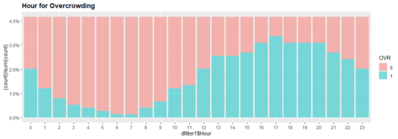
#hR CHART SHOWS GOOD REP FOR OVR
NAVGdist <- ggplot(data=dfilter1, aes(x=dfilter1$Hour, fill=OVR)) +
  geom_bar(aes(y = (..count..)/sum(..count..)), position='stack', alpha=0.5) + scale_y_continuous(labels=scales::percent)
print(NAVGdist + theme(plot.title=element_text(face="bold")) + ggtitle('Hour to Overcrowded'))

#Color variation of when OVR occurs
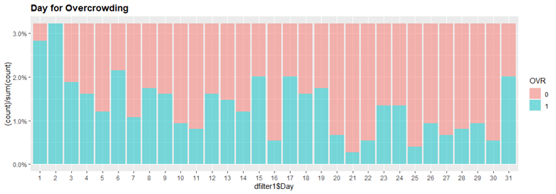
##Pretty cool Day Chart
NAVGdist <- ggplot(data=dfilter1, aes(x=dfilter1$Day, fill=OVR)) +
  geom_bar(aes(y = (..count..)/sum(..count..)), position='stack', alpha=0.5) + scale_y_continuous(labels=scales::percent)
print(NAVGdist + theme(plot.title=element_text(face="bold")) + ggtitle('Day to Overcrowded'))
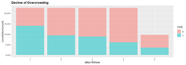
#good rep of decline in overcrowded
NAVGdist <- ggplot(data=dfilter1, aes(x=dfilter1$Week, fill=OVR)) +
  geom_bar(aes(y = (..count..)/sum(..count..)), position='stack', alpha=0.5) + scale_y_continuous(labels=scales::percent)
print(NAVGdist + theme(plot.title=element_text(face="bold")) + ggtitle('Decline of Overcrowding'))
Scatter Plots
ggplot(dfilter2, aes(x=DEP,y=AVG))+
  geom_point(aes(color = factor(NAVG)))+
  labs(title="NEDOC AVG chart")

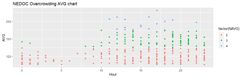
ggplot(OVERA, aes(x=Hour,y=AVG))+
  geom_point(aes(color = factor(NAVG)))+
  labs(title="NEDOC Overcrowding AVG chart")
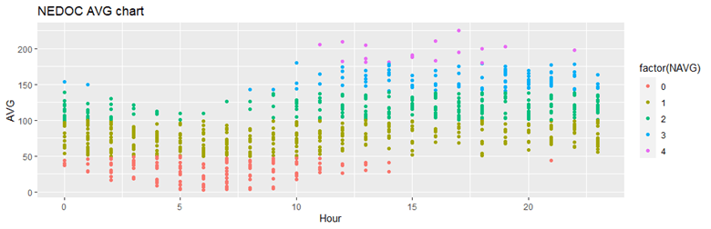
ggplot(dfilter2, aes(x=Hour,y=AVG))+
  geom_point(aes(color = factor(NAVG)))+
  labs(title="NEDOC AVG chart")
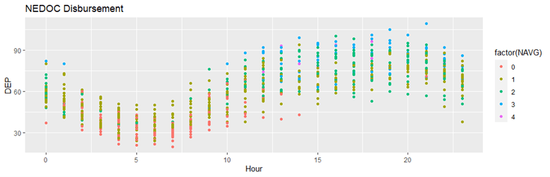
ggplot(dfilter2, aes(x=Hour,y=DEP))+
  geom_point(aes(color = factor(NAVG)))+
  labs(title="NEDOC Disbursement")
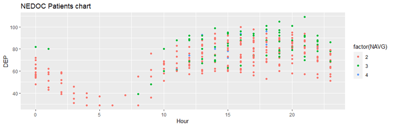
ggplot(OVERA, aes(x=Hour,y=DEP))+
  geom_point(aes(color = factor(NAVG)))+
  labs(title="NEDOC Patients chart")
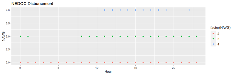
ggplot(OVERA, aes(x=Hour,y=NAVG))+
  geom_point(aes(color = factor(NAVG)))+
  labs(title="NEDOC Disbursement")
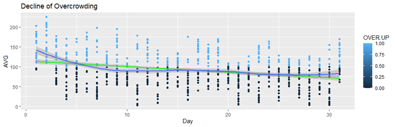
#predictive and trend for OVR crowding all
ggplot(data=dfilter2, aes(x=Day,y=AVG,color=OVER.UP))+
  geom_point()+
  stat_smooth(method= "lm", col = "green")+
  geom_smooth()+
  labs(title="Decline of Overcrowding")
#predictive and trend for OVR crowding over up
ggplot(data=OVERA, aes(x=Day,y=AVG,color=NAVG))+
  geom_point()+
  stat_smooth(method= "lm", col = "green")+
  geom_smooth()+
  labs(title="Decline of Overcrowding")

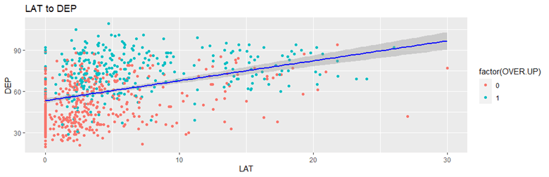
ggplot(dfilter2, aes(x = LAT, y = DEP)) +
  geom_point(aes(color = factor(OVER.UP))) +
  stat_smooth(method = "lm", col = "blue")+
  labs(title="LAT to DEP")
Corrplot/Correlation matrix
corViz <- select(dfilter2, DEP,EDW,CC,DTB,LAT,Hour,Day,Week,NAVG,NML,BSY,OVR,SEV,DNG,OVER.UP,SEV.UP)
str(corViz)
corViz$OVR <- as.numeric(corViz$OVR)
corViz$SEV <- as.numeric(corViz$SEV)
corViz$OVR <- as.numeric(corViz$OVR)
corViz$SEV <- as.numeric(corViz$SEV)
corViz$DNG <- as.numeric(corViz$DNG)
corViz$Hour <- as.numeric(corViz$Hour)
corViz$Day <- as.numeric(corViz$Day)
corViz$Week <- as.numeric(corViz$Week)
corViz$NAVG <- as.numeric(corViz$NAVG)
numcol <- sapply(corViz,is.numeric)
pearsoncor <- cor(corViz[numcol], use="complete.obs")
corrplot(pearsoncor, "number")

Box and Whisker
plot(DEP ~ OVR, data=dfilter1)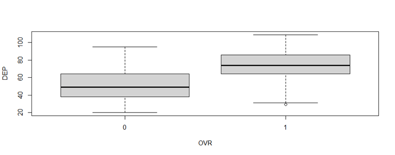
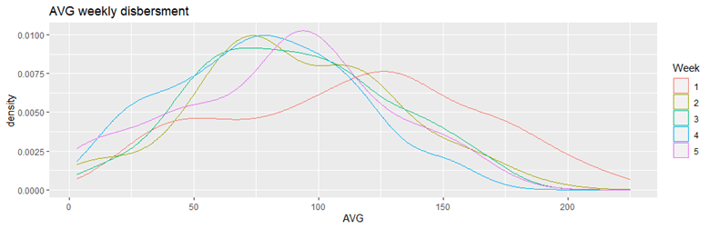
Line Graphs
ggplot(aes(x = AVG, color = Week) ,data = dfilter1) +
  geom_density() +
  labs(title="AVG weekly disbersment")
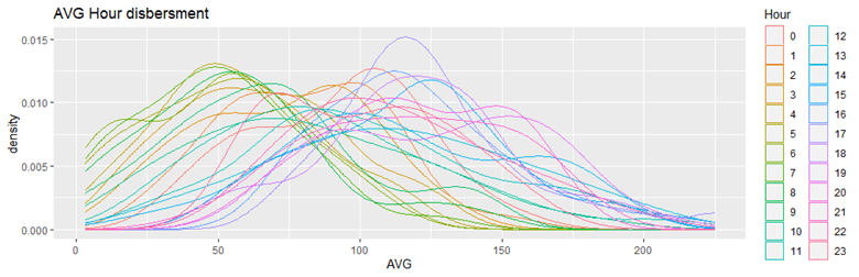
ggplot(aes(x = AVG, color = Hour) ,data = dfilter1) +
  geom_density() +
  labs(title="AVG Hour disbersment")